Quiet prestige
A refined, confident name that does not rely on direct or loud luxury language.
A project for a fine jewellery house in Qatar. It started with naming strategy, checks and development. After the client chose the name, the work moved on to an Arabic and English identity that works across packaging, print, the digital presence and future growth.
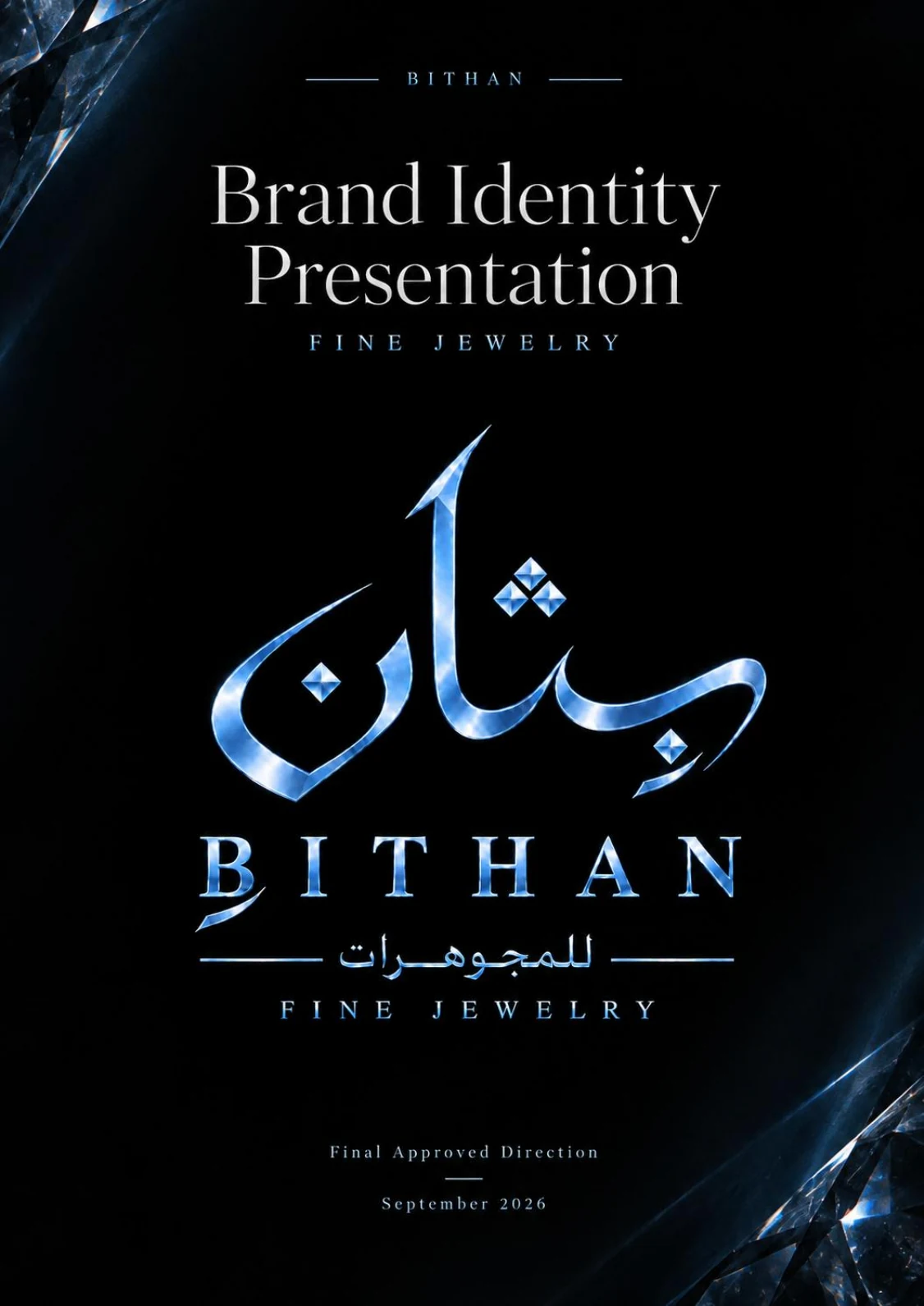
The project was for a fine jewellery brand launching digitally in Qatar, with ambitions to grow into a wider commercial and physical presence. The name had to carry prestige, work when spoken and read, and remain right as the brand grows.
A refined, confident name that does not rely on direct or loud luxury language.
Easy to pronounce, read and use in both languages.
Distinctive, without relying on category words such as Gold, Diamond or Jewels.
Able to extend to new collections, products and channels, not only one product.
Has a layer of meaning that can carry the brand's story and emotional connection.
Can carry a logo, an identity, packaging and long-term brand value.
Rather than jumping straight to generating names, the project first defined the linguistic and emotional territories worth exploring. That kept the work coherent, and client feedback changed the logic of the naming itself, not just the order of a list.
Rare Arabic roots, cultural depth and an elegant voice.
Presence and value without direct luxury language.
Constructions that can be owned, with clear linguistic and phonetic logic, not random letters.
Names built around heritage, light, memory, time and lasting value.
Names were removed before presentation if they were weak in pronunciation, poor in category fit, limited in how far they could extend, lacking distinctiveness, or not practically available.
TAFAROD · MAKNOUNAH · KUNNH · NAFAYS · TeLaAD · AZAREON
REFINEMENT ROUNDARSINA · HAMSINA · ORSINA · AURSINA · AUSINA · KLEOSINA
The client chose BITHAN at the end, after strategic exploration of the naming territories, the shortlists and the development rounds.
Domain, online presence and conflict checks were practical preliminary checks only, not a legal opinion. Final legal verification of a trademark should be carried out with the competent authority or a qualified legal adviser before registration and launch.
Want to apply the same naming steps to your project? See our brand naming service.
 View the full-size design ↗
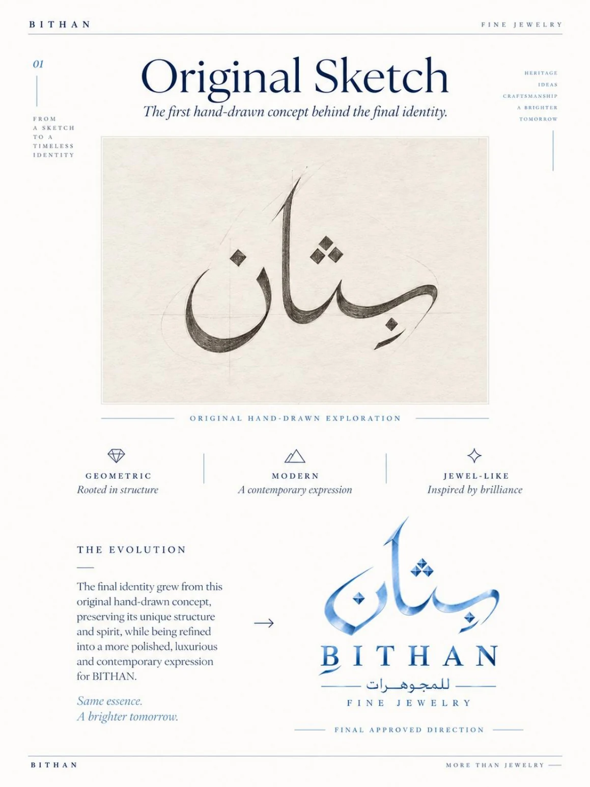
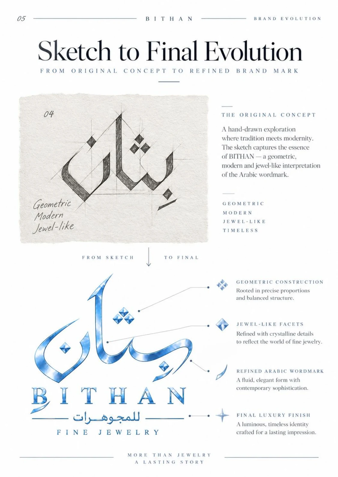
The final identity kept the Arabic spirit and the distinctive shape of the first direction. Its construction, proportions and details were then refined, so the expression feels more contemporary and suits the world of fine jewellery.
The same essence, expressed with more maturity.
The final system gives the identity the flexibility to work on premium packaging, print, social media, small digital spaces and both light and dark backgrounds, without losing recognition.
 View the full-size design ↗
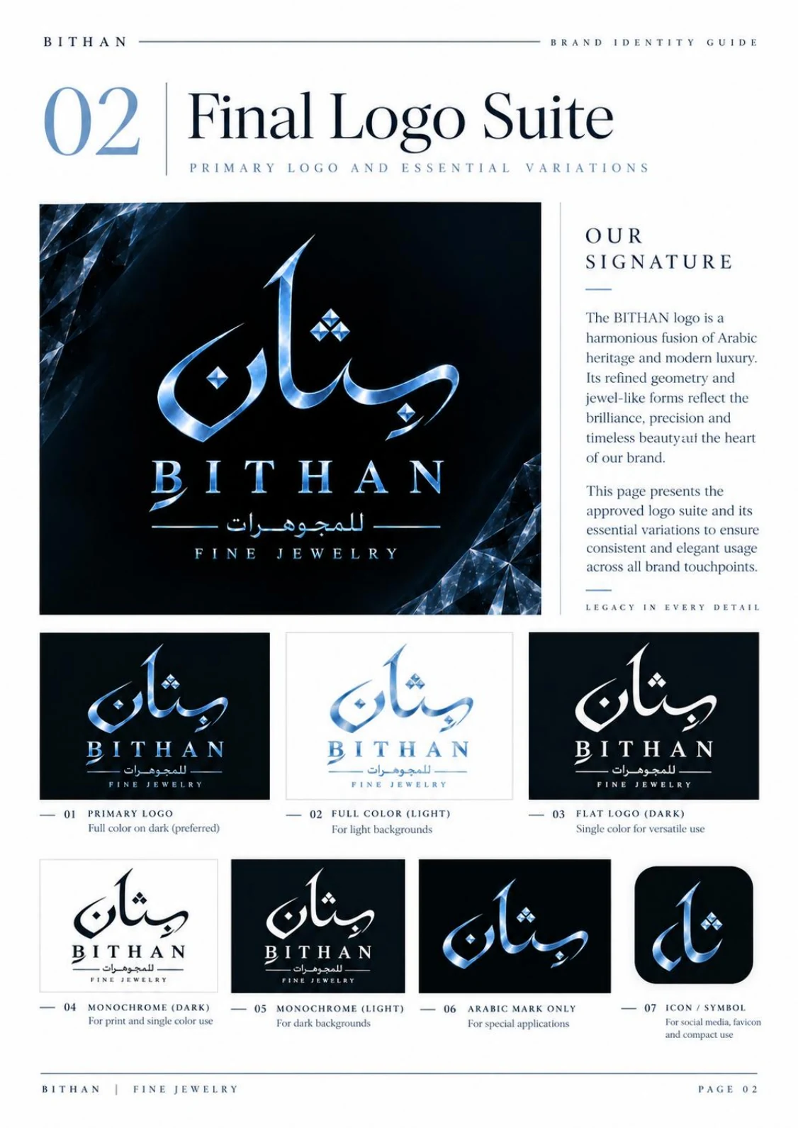
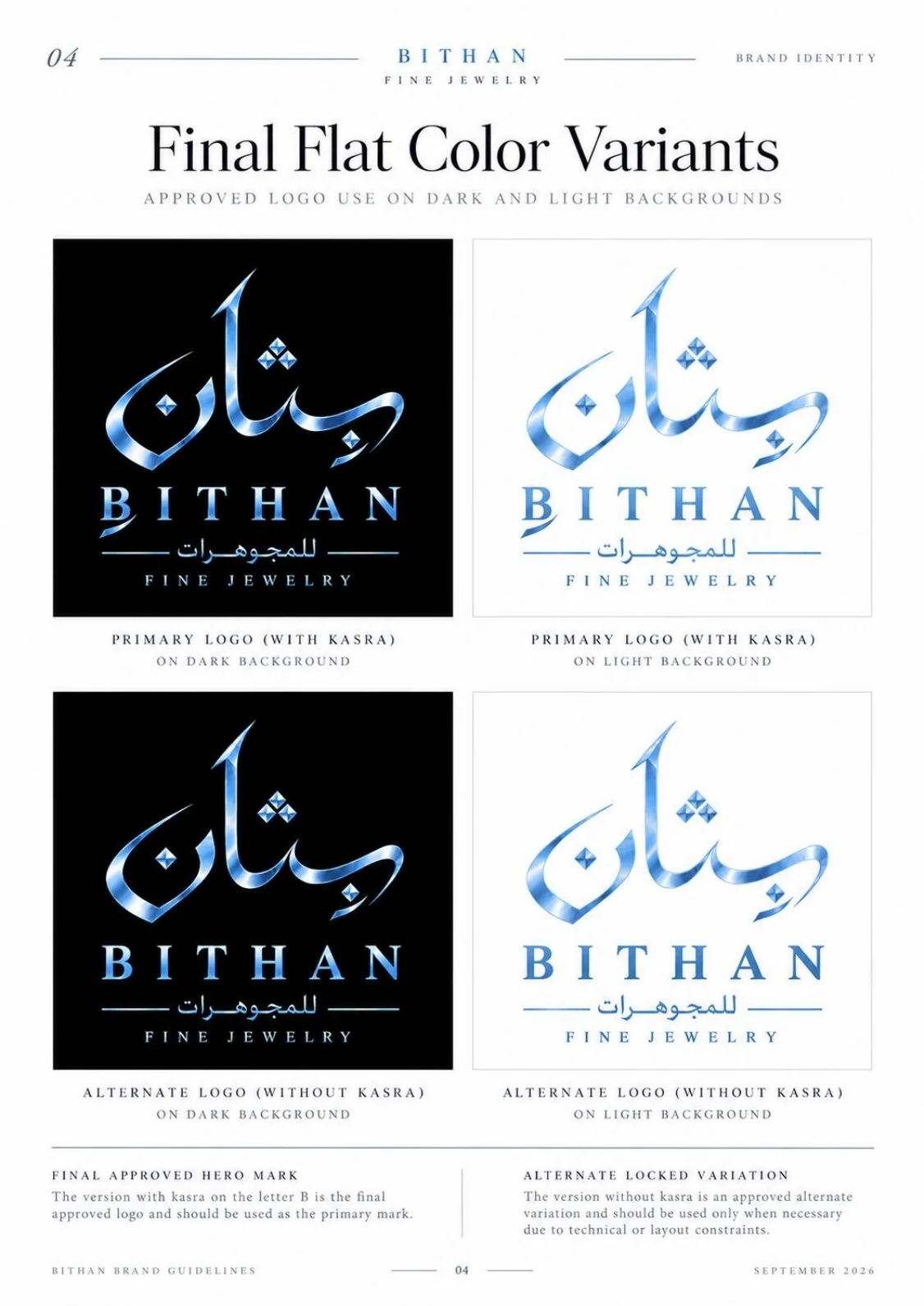
The logo combines the roots of Arabic calligraphy with a modern sense of luxury. The polished structure and gem-like details express precision and brilliance, and the system of versions keeps the brand consistent at every point of contact.
Legacy in every detail.Full colour version on dark backgrounds, the preferred use.
For use on light backgrounds.
A single-colour version for flexible use.
For print and single-colour applications.
For use on dark backgrounds.
For applications that need a short Arabic signature.
For social media, small digital spaces and favicons.
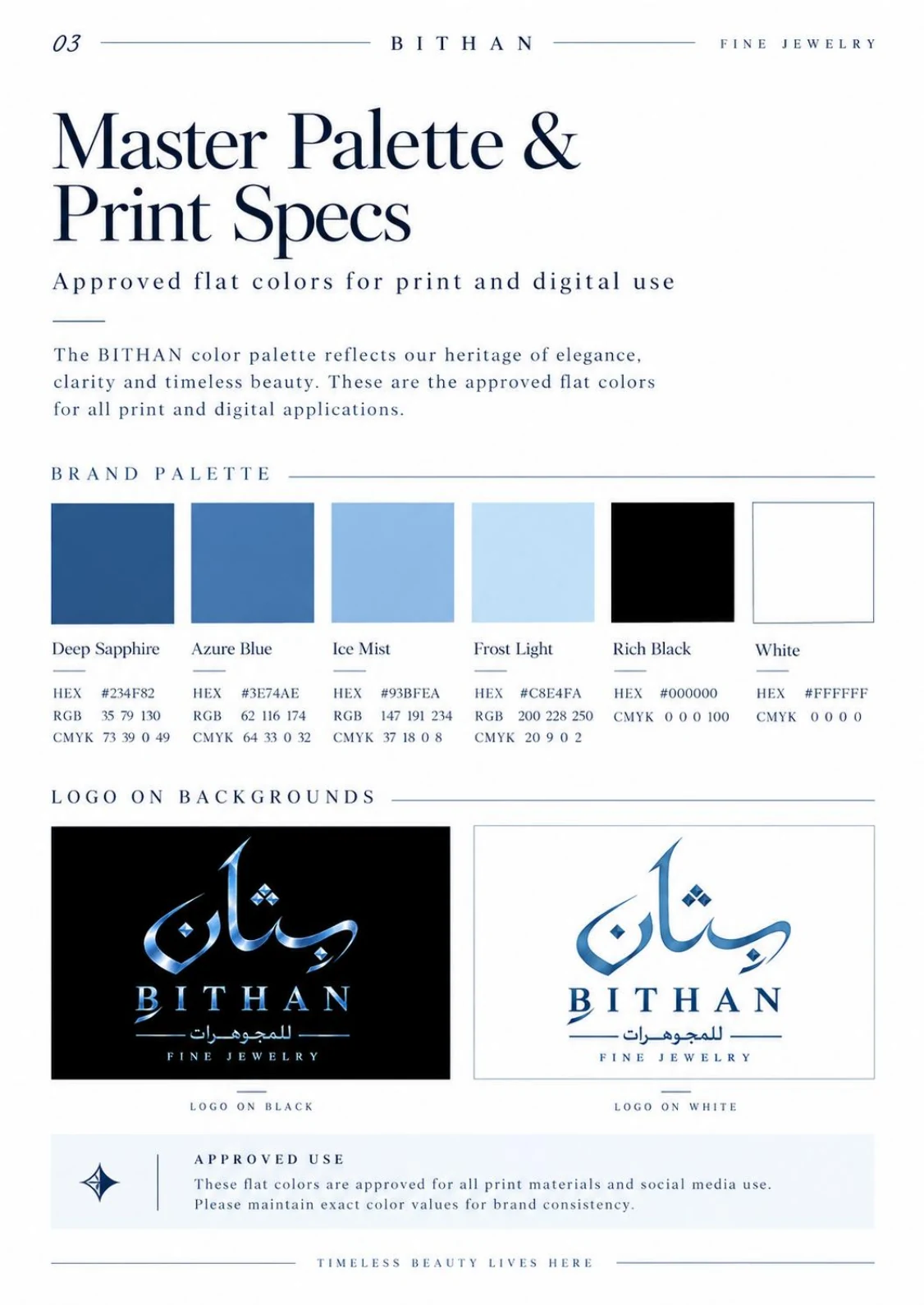
The identity is built on deep sapphire and lighter blues for a cool, crystalline feel, with black and white for contrast and flexibility.
 View the full-size design ↗
The primary mark is the version with the kasra (the vowel mark) on the letter ba. The version without the kasra is an approved alternative, used only where there is a technical need or a space constraint.
 View the full-size design ↗
 View the full-size design ↗
More precise proportions and a balanced visual structure.
Crystalline details that link the mark to fine jewellery.
A flowing Arabic movement, with more control and a modern finish.
A luminous, cohesive identity designed to leave a lasting impression.
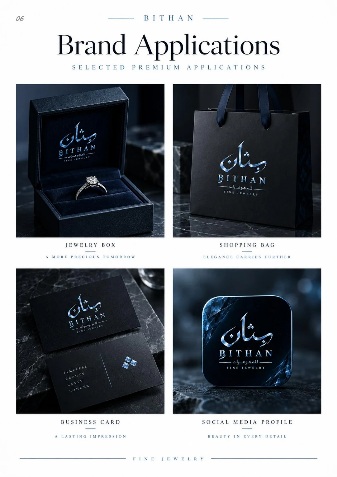
The identity was tested on core touchpoints to confirm that the mark, the colour and the premium feel hold together in real use.
 View the full-size design ↗
Packaging
Retail
Stationery
Digital
If you need naming, brand strategy or a visual identity, send a short summary of your project and we will suggest the best starting point.
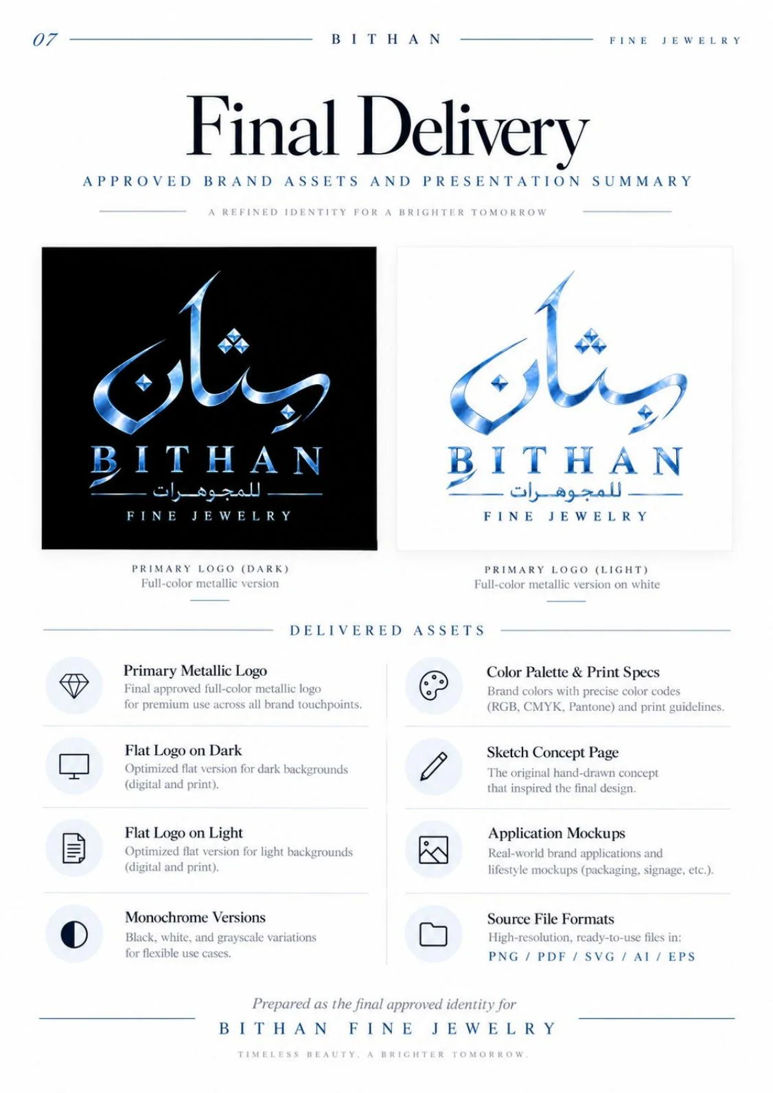
The final delivery was not limited to the logo. It included metallic, flat and monochrome versions, print specifications, applications and source files.
 View the full-size design ↗
The approved final metallic logo for premium uses.
A flat version optimised for dark backgrounds, print and digital use.
A flat version optimised for light backgrounds, print and digital use.
Black, white and single-colour versions for a range of uses.
Approved colours with HEX, RGB and CMYK values for print and digital use.
The original hand sketch from which the identity direction began.
Selected applications for packaging, business cards and the digital presence.
High-resolution, usable files: PNG, PDF, SVG, AI and EPS.
Direct answers to the points a client weighs when comparing naming, brand strategy and visual identity services.
The project covered naming strategy, naming routes, shortlists, refinement and preliminary checks. After the client chose the name, the identity was developed from the sketch to the final logo, the colour system, the applications and the source files.
Yes. The case records that the client chose BITHAN after strategic exploration of naming routes, shortlists and development rounds.
No. The domain, online presence and conflict checks were practical preliminary checks, not a legal opinion. Final legal verification should be carried out with the competent authority or a qualified adviser before registration and launch.
The delivery included the primary metallic logo, flat versions for dark and light backgrounds, monochrome versions, the colour palette and print specifications, the sketch page, identity applications, and source files in PNG, PDF, SVG, AI and EPS.
BITHAN moved from a naming challenge to a name chosen by the client, then to a complete identity with a distinctive Arabic signature, bilingual use, controlled logo versions, production colour specifications and premium applications.
We do not claim commercial performance figures for this case, because none are documented here. Its value is the complete method, from the strategic decision to a visual system that can be applied.